Thursday, December 12, 2013

Photograms

I wanted to try making a photogram because I saw there could be two meanings to what you made, what you used and what you made it look like, and that intrigued me. For this project I decided to use some souvenirs I got on my trip to Hawaii this past summer, namely a lei, a conch shell, and turtle necklace. 


First, I just put all the materials on a test strip in no particular order and tried exposing them to various levels of light. I found out that with longer exposures you get more detail in the picture, showing the metaliciness of the necklace, the fabric texture of the lei, and the different layers of shell on the shell.

Test Strip #1- 20 second exposure

Since I then knew how the materials reacted to the light, I began thinking about what kind of design I could arrange them in. I wanted to do something that would emphasize the beachy origins of the materials. Finally, I decided on a beach scene with the shell as a sunset, the lei as some seaweed at the bottom of the ocean, and the turtle as if he was swimming through the scene.

So to do this, I first put the shell on the photo paper and covered the rest with the book. I exposed this for 15 seconds so that there would be a slight difference between the body of the shell and the spines, but not much. Then I took the shell off the paper and put the necklace and lei on. I covered the area where the shell had been with the book and exposed the rest for 20 seconds, to get more detail. I discovered that if I left the chain of the necklace to trail behind the turtle it looked a little like a slip stream of water trailing behind the turtle and the the clasp in front of the turtle looks like a fish it is chasing. I also discovered while experimenting that when water gets on the paper it leaves a little bubble mark. Since I was doing an underwater scene I decided to drip some water onto the paper on purpose to look like little bubbles.

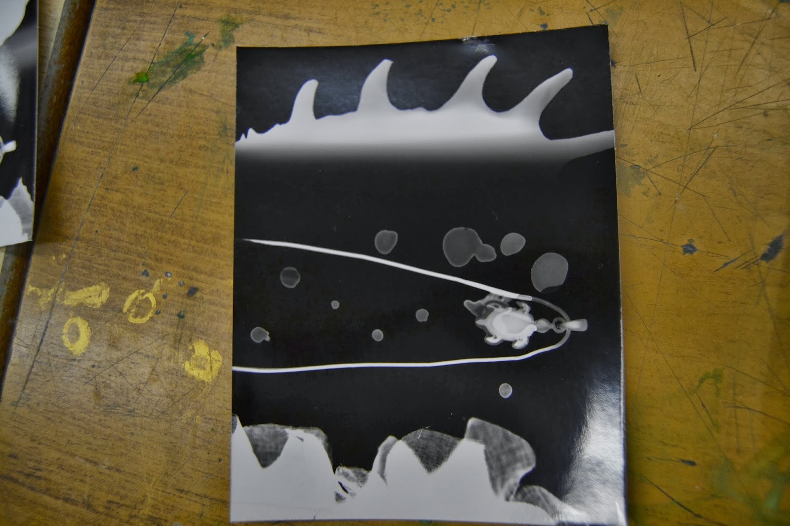
Final Copy- 15 seconds for shell (sunset), 20 seconds for turtle necklace and lei ( swimming turtle and sea plants)

I feel that this project has been pretty successful. I really like the end product and I think it is adorable. I feel that I was relatively innovative in this project, with my idea and my water bubbles and even my double exposing, and the product came out looking good. I thoroughly enjoyed this project!

Saturday, December 7, 2013

Silk Screen Printing Assignment

For this assignment we had to take a picture we had taken and put it on a t-shirt with a silk screen. I chose to use this photo because it was quite plain and simple, but still visually interesting and I could think of a good slogan I could put with it.

As you can see, this is not really a very ornate photo. But with a little photo-shopping, I can turn it into a cool pro-reading shirt.

First I took the screen and stretched it across a wooden frame. Then I painted it with a light-sensitive emulsion and put it in the dark room for a day to let it set. Then I photo-shopped the photo so that I had three different pictures; one with a white background and an all-black book, one with an all-white book and a black background, and one with everything white except the text and the line in the center of the book where the spine was. I also added the slogan "Shhhhhh... I'm Reading" in a spot where the text didn't show up. Then I asked Ms. Zanini to put these photographs on see-through sheets of plastic. When I had the sheets, I put them on the light table with the screen on top of them and turned the light table on. After 10 minutes I took it off the light table and scrubbed at the screen so the emulsion came off of the areas where the light didn't touch, or where there was black on the plastic sheets. After that I just mixed up the colours I wanted on my shirt, and used a squeegee to push them through my screen onto my shirt! I even added some little dots of blue colour because I thought they would look cute and they covered up one little smudge of blue paint on my shirt.The end product looked like this.


I like they way the end product turned out because I think it is visually interesting and came out the way I wanted it to. I also like they way this turned out because what you wear on your shirt can represent you, and I managed to come up with a picture and slogan that does just that. When people look at what you are wearing, they usually make a snap judgement on your personality based on your clothes, whether they want to or not. This shirt can tell everyone I love to read, correctly portraying my personality.I feel like I did a good job on this project.

Thursday, November 28, 2013

Alternative Processes- Multiple Exposures

Test strip #1- 5 second per strip 

 Test Strip #2- 5 seconds per strip

Test Square # 1- Book- 15 seconds Plant- 10 seconds


Final Copy
Book- 14 second exposure Plant- 15 second exposure

I decided that for this project, I wanted to try making a double exposure. For the double exposure, I wanted something coming out of a book, so I took pictures of multiple plants. I chose to use this one in the end because it was the straightest, so it would look like it was growing right out of the book.

In order to make the double exposure, I first used test strips to figure out how much I should expose each photo for individually. Then I started practising the burn-and-dodge technique. Once I thought I had the hang of it, I made a good copy of the photo and showed it to Callie. She thought I should try to crop out the table was sitting on, as it really was just empty space. I agreed with her. This lead to another round of sizing, making test strips, and testing the burning and dodging technique. In the end I got the above product.

I wanted to make a plant coming out of a book because I really love to read, and when I read it is sometimes like the story is coming out of the book and is like a play or a T.V. show playing in my mind. I tried to capture that feeling by using photography to show something actually coming out of a book. It was pretty cool to make something I imagine in my head become real through photography.

Overall I am decently pleased with my end product. I don't think it is my best work and if I had more time I could probably have made it better, but this was my first time using this technique so it's not half-bad for a beginner. I really like that the plant really looks like it is coming out of the book and that I got the exposures to match. If I could go back and change one thing, I think I would simplify the background behind the plant more, to make sure the focus went straight to the subject.

Wednesday, November 6, 2013

Mixed Lighting

1/50 shutter speed, aperture 7.1
Camera 205 (Nikon D3100), zoom lens.

In this project we were supposed to use both natural and studio lighting. After trying and failing to find a plug close enough to a door to bring the lights outside, I decided a shot at a window would be the best way to go. I chose this door window, which led to an area near the sports field. After setting up a fill light ( I really liked the natural light outside, so I didn't want to overwhelm it with artificial light; I set up the fill light just so there weren't so many deep shadows made by the natural light on the model's (Ally's) face.) I asked Ally to look outside at the field and started taking photos. I got this one because Ally was concerned that it may rain later on, but put into the context of the picture it looks really dramatic.It almost looks to me like she is biting her lip and contemplating the sports players outside, as if she wants to play with them but for some reason cannot. It really was sheer luck that I captures this expression, but it made for a very interesting and dynamic photo.

After taking the photo, I put it into Photoshop for some minor editing. I cropped the photo so that there was no unnecessary blank space, and so that Ally was in a better place in the photo (obeying the rule of thirds a bit more). I then made the photo black and white, because some of the colours in the photo clashed a bit and without them you can really focus on the composition and message of the photograph.

Overall I do like this photo. I feel it captures a scene in an interesting way that conveys a story, and I feel I made good use of both indoor and outdoor light.

Friday, November 1, 2013

Painting with Light

Our assignment was to take flash lights into the darkroom and use a long shutter speed to capture the path of the lights as we drew with them. I first thought this would be easy, but I was definitely wrong! Not only is the darkroom super creepy when you are alone and its totally dark, but its hard to know where to paint with light to get the exact picture you want. But, I did manage to get an end result I am pleased with.


30 second shutter speed, aperture 16
Camera 204 (Nikon D3100), zoom lens.

I liked the concept of incorporating a person with the light elements, because I thought it was more interesting than just a person or a light drawing alone. I then noticed how when you shone a white flash light on people and drew around them it kind of looked like they were glowing. This made me think of angels, so I tried drawing wings and a halo around Sophia. I really liked the effect! Then I tried doing double exposures of people, and thought that it was quite cool how it made people looked like ghosts. so for my photo I combined the two, to make a ghost angel behind a sad-looking girl. I think this photo looks very cool, and I like how dark and simple the background is. This shot took three days of experimentation to get, but I think it was definitely worth it.

Using the angel wings and halo, I tried to make a supernatural side to my photo. I wanted the mythical side because I wanted to create a feeling of wonder in my viewers. I wanted to make the viewers feel this sense of wonder because this is how I feel about light photography. You can use it to alter the reality of your photo and make anything real. Light photography makes me feel like there could be angels or fairies or a number of impossible things, because we can make these impossible things real through photos. I tried to make the viewer feel this by making an angel come out of the darkness, as if she was always there but you have to look harder to see her.

All the shots I tried to take were inspired by the works of The Light Junkies. Check them out!  This particular shot was inspired by their shots where they outlined a person or added elements to them and their surroundings, but I also attempted thinks like the light globes, the flower drawings, and the river-like streams of light.

Monday, October 28, 2013

Renaissance Mash-Up

For this project, I had to put some of my friends into a renaissance painting. I chose one of Caravaggio's paintings, called The Conversion of the Magdalene.

The Conversion of the Magdalene by Caravaggio

This painting was made during the renaissance, a period of artistic expression in Europe during the 14th to 17th centuries. The renaissance was a period of artistic expression that began after the Medici's, a very powerful family that lived in Florence and started a trend by backing artists to make statues, paintings, and monuments in their name. Backing artists became a trend because it showed off your wealth, and artists liked it because before this period their work wasn't appreciated, and most artists lived in poverty. During the Renaissance there was a lot of artistic exploration, and a lot of progress was made towards making paintings more detailed and three-dimensional. And because the images become more like photographs, it is easy to Photoshop a face from a picture into them.

This painting was made by an artist named Michelangelo Merisi da Caravaggio, who was considered the first great baroque style painter. He was relatively well-known in his time period, and had a lot of sponsors from the start, but was addicted to street brawling. He was forced to flee Rome with a price on his head after killing a man in a sword fight. by 1610 he was dead, possibly by the hands of his old enemies.

Caravaggio painted in a baroque style, even though he was still living in a strongly renaissance society. Characteristics of baroque paintings include a sense of energy, movement, tension, ad strong light and dark areas. There was also very prevalent religious themes in art at the time. all these characteristics can be seen in The Conversion of the Magdalene.

This painting portrays a bible scene in which Mary Magdalene being convinced to convert to Christianity. throughout history her role in the bible changed frequently, but in this era she was written as a prostitute who found faith. The mirror, ivory comb, and cosmetics jar are all supposed to represent Mary's past sin, vanity, and the flower she is holding and the ring on her right hand represent her new "marriage" to God and spirituality. The light source is coming from the far right, casting a shadow over Martha (far left, trying to convince her sister Mary of her sins.) and putting Mary (far left) in full light. There is speculation that for two well-known aristocrat women of the time posed for the painting, which would have made the painting more interesting for people in the Renaissance.

I put my friends Mia Carnevale and Sophia Davidson into this painting. Sophia is Mary Magdalene and Mia is Martha.

Mia: On Left
Sophia: On Right

Mia's Photo: 1/3 shutter speed, f5. Camera 204 (Nikon D3100). Zoom lens.

Sophia's Photo: 1/10 shutter speed, f5. Camera 204 (Nikon D3100). Zoom lens.

I tried to emulate the lighting in the original painting using studio lights. I then went into Photoshop and edited any colour differences, put a cross-hatching filter on the faces to make them look more painted, erased spaces for the painting's hair to show through,and used the stamp tool to fill in any spaces and blend the skin into the painting. Overall I am pretty pleased with the end product!

Sources

Friday, October 18, 2013

Proper Studio Lighting

1:2 Lighting; 1/50 shutter speed, aperture 7.1
Camera 205 (Nikon D3100), zoom lens.
This is a simple shot with very simple lighting, but I like the way it looks anyway. It looks good because the model (Moira) is looking straight on at the camera with her body twisted slightly, which is a very flattering pose.I am proud of this shot because in it I got the light balance right, which is usually hard for me.
Strong lower right light; 1/70 shutter speed, aperture 7.1
Camera 205 (Nikon D3100), zoom lens.
I took this shot using a very strong light in the right bottom of the frame. This was to try to create interesting shadows and light patches. While since Moira's hair is very light in colour and therefore reflected a lot of light, causing part of this photo to be a bit overexposed, I was able to fix most over brightness in Photoshop. And anyway, the extremely light and more dark areas help make the contrast I was trying to create!

Strong back light; 1/50 shutter speed, aperture 7.1
Camera 205 (Nikon D3100), zoom lens.
For this picture I wanted to try to create a sort of "halo" effect around Moira's hair by placing a light directly behind her. The only other light in the photo was the light coming in from the door, making Moira's face very dark while her head is surrounded by light. This was hard to expose properly, but luckily I had Photoshop to help make up the difference of what I couldn't get quite right. I think it is cool how her hair sort of glows from behind. I like the effect this photo gives because it is very unique and unlike most portrait photographs. 

My inspiration for these shots was Richard Avedon's portraits, and the way he captures emotion by talking to his subjects and snapping pictures to capture the raw emotion on their faces. I tried to do something similar with emotion by talking to the person I was photographing. All these Photos were taken when Moria looked back at me during a conversation.I also tried to use this project to learn about different lighting and lighting techniques, so I started with simple lighting like 1:2, and then tried to improvise with the strong light under her face and behind her.